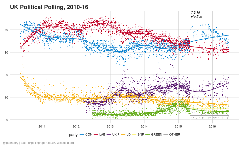
Trends in UK political opinion polling
In light of last week’s EU Referendum shockwave I had a quick look into the polling situation. Plotting a few graphics of data from ukpollingreport.co.uk and wikipedia.org, here are the results:
30 June 2016
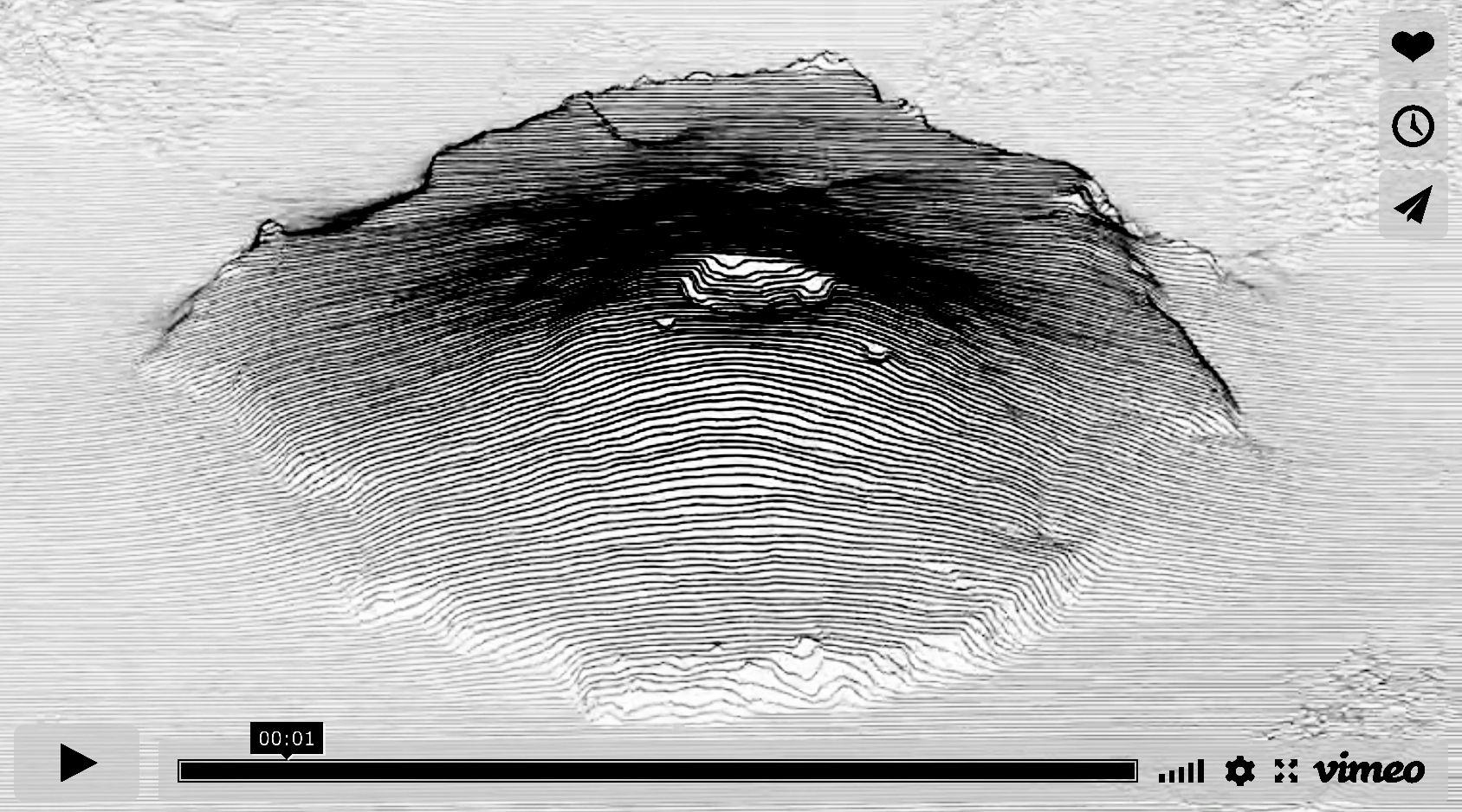
Olympus Mons
The Solar System’s largest mountain – a Martian shield volcano the size of Italy rising 26 km above its surrounding plains, with a mean elevation of 22 km and a caldera 3 km deep.
06 March 2016
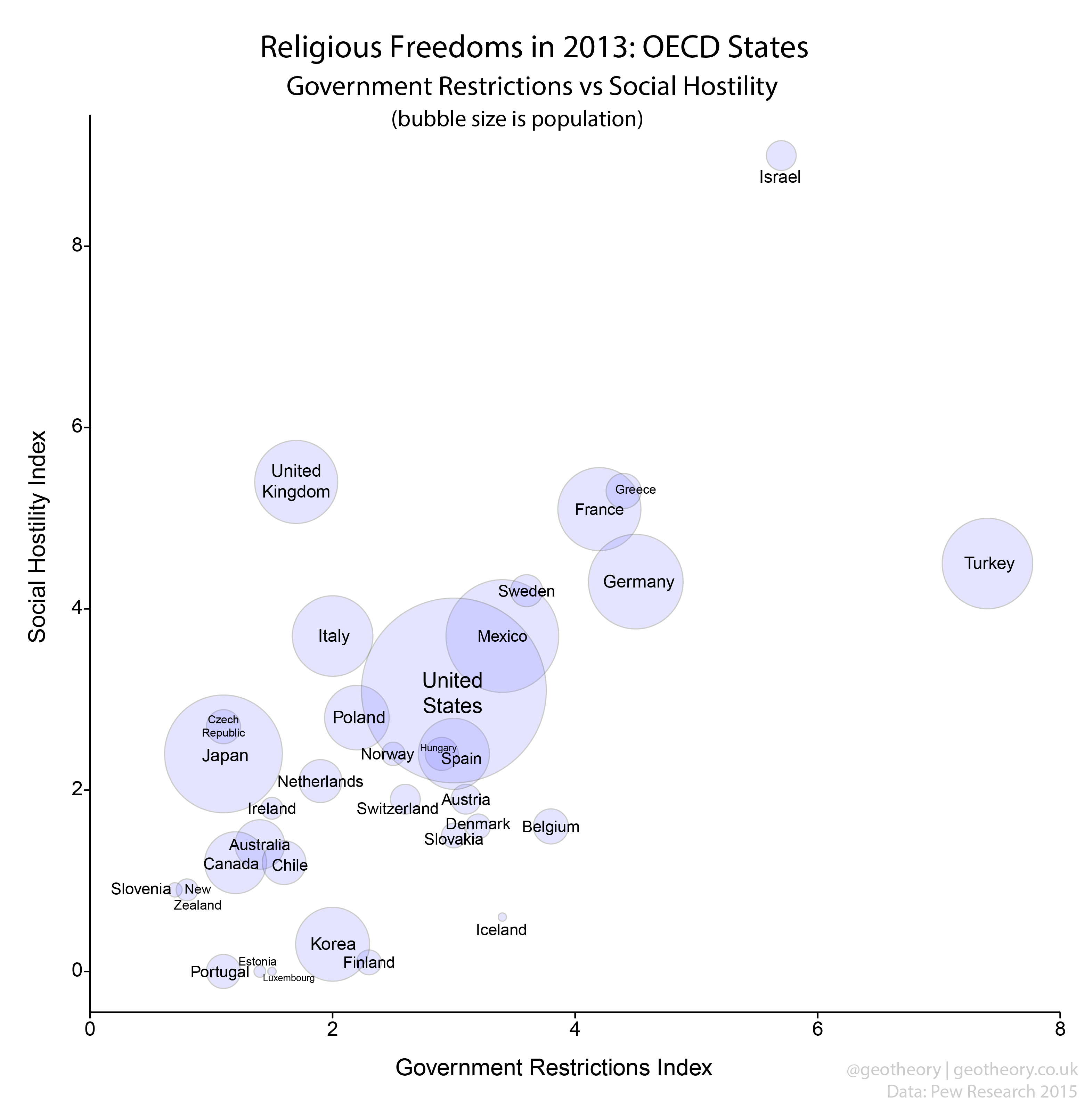
Religious freedoms in OECD states
The Pew Research Center yesterday published their 2013 report on global trends in religious restrictions and hostilities. The study develops two indicators, the Government Restrictions Index (GRI) to reflect the legal/political aspects of religious freedom, and the Social Hostilities Index (SHI) to examine it at societal/community levels. GRI and SHI scores are calculated for each country from 17 frequently cited human rights reports published by UN bodies, select diplomatic services and NGOs.
27 February 2015
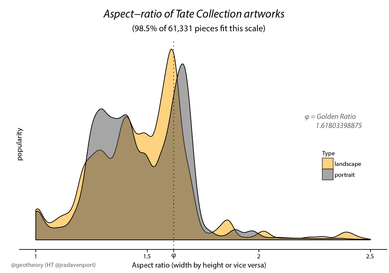
Golden Ratio in Tate artworks
Some visualisations inspired by if we assume’s post on the dimensions of art. Everything’s in the titles of the graphics.
17 February 2015
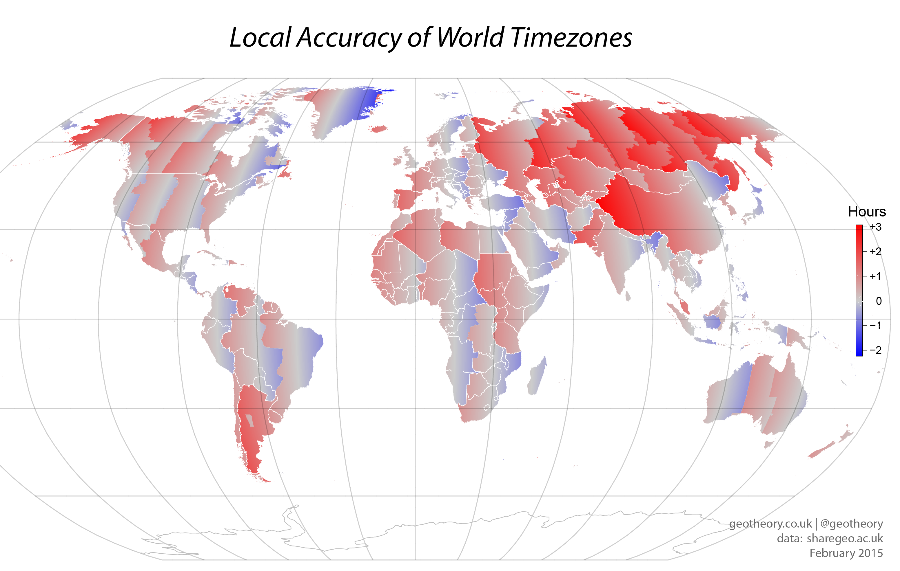
Mapping the accuracy of time zones
We all scratch our heads from time to time about time-zones. As well as the logistical and administrative complexities they create, the choices some countries make about their time seem strange. Such as China’s decision to have a single zone for a country that spans over 60° (four hours) of longitude - 2° more than the contiguous US States which span four time zones. In Tibet solar time is more than two hours behind official time, leading to a tension between Beijing time and semi-official Xinjiang time. We might ask which other parts of the world have unusual relationships with their official time.
06 February 2015
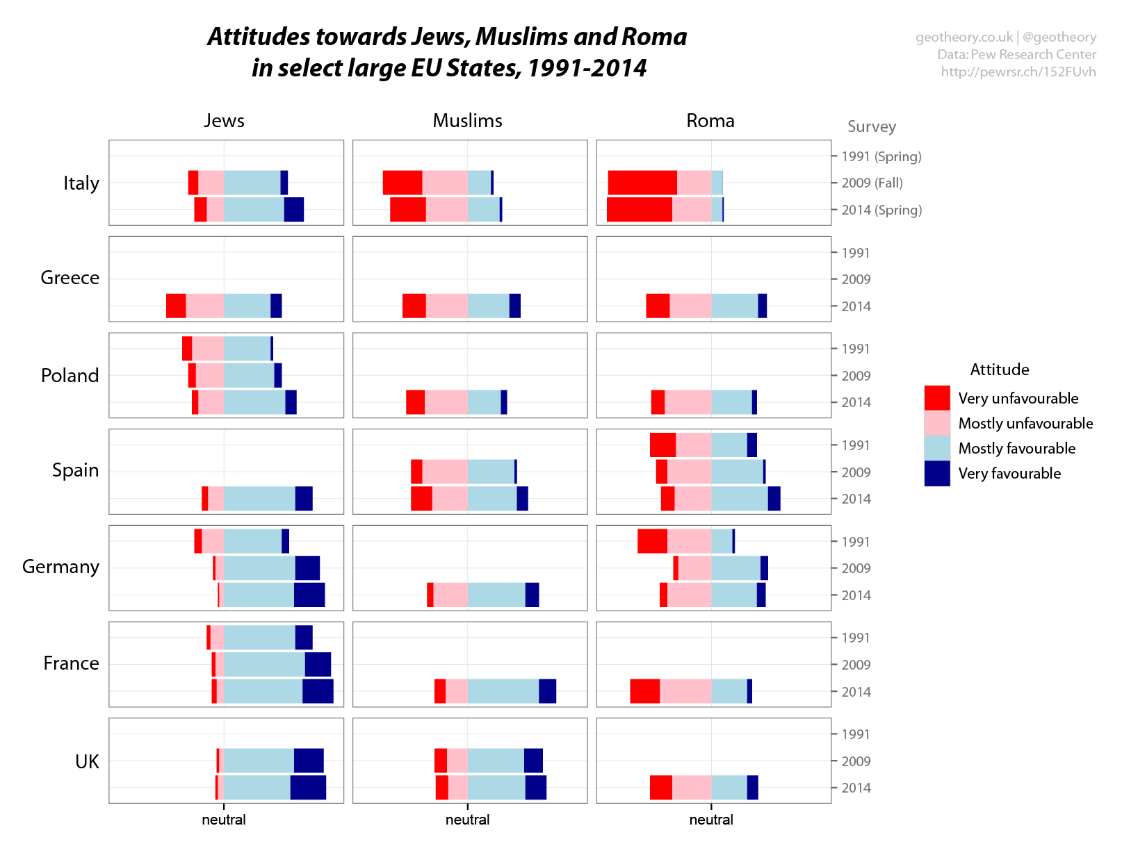
Changing European attitudes towards racial minorities
European attitudes towards certain minority groups are currently under much scrutiny in the wake of Israel’s recent military action in Gaza and particularly the Charlie Hebdo attack in Paris two weeks ago. Speaking yesterday at an event commemorating the attack’s Jewish victims, British Home Secretary Theresa May announced an increase in funding to police against anti-semitism. In France police have been deployed to protect Jewish schools. There’s also growing evidence of a backlash against Muslim communities, such as the anti-Islam rallies held yesterday in Munich and Berlin in defiance of a police ban, and with a new rally planned in Dresden.
20 January 2015
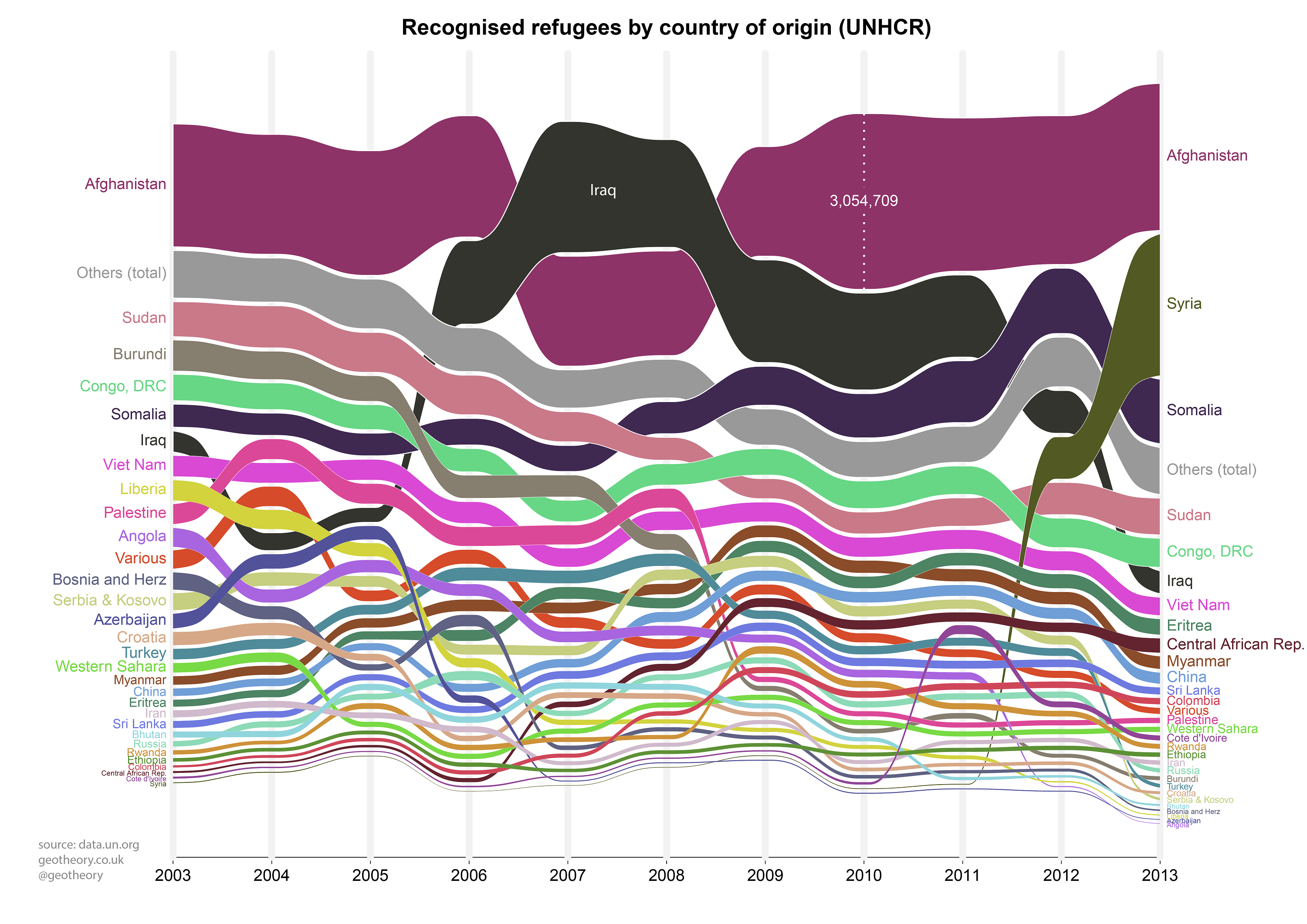
Refugees - Alluvial visualisation
An appendum to yesterday’s post on time-series alluvial plots, this time looking at some data from UNHCR on refugee numbers over the past decade. Comparing the two graphs gives an idea where the majority of refugees from each conflict area have been registered by UNHCR (presumably not necessarily the final destinations for many).
18 November 2014
Alluvial visualisation of time-series data
My last post included a couple of plots of UK urban population growth, one of the absolute data and one with rank orders. Someone suggested visualising both together in an alluvial plot, which ranks data up a series of y-axes, each of which can represent a different data attribute. It’s a similar method to the parallel coordinates plot, except it also maps data values to line thickness and adds some swishy curves. Here I’ve tried disaggregating time along the x-axis instead, which I think (tweet me if I’m wrong) should make it a static network time-series alluvial.
17 November 2014
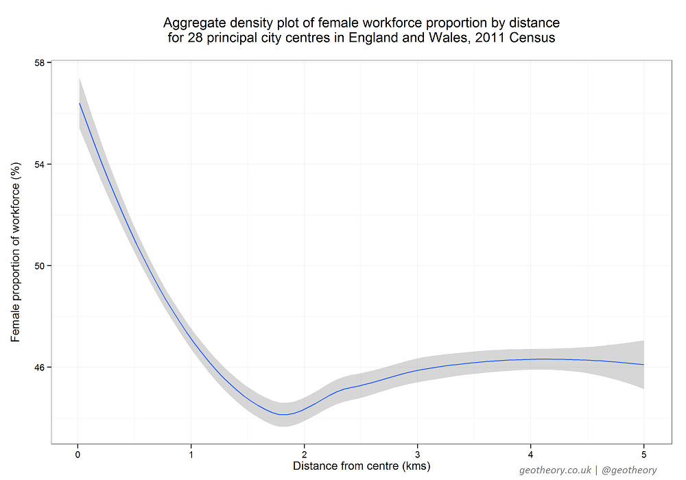
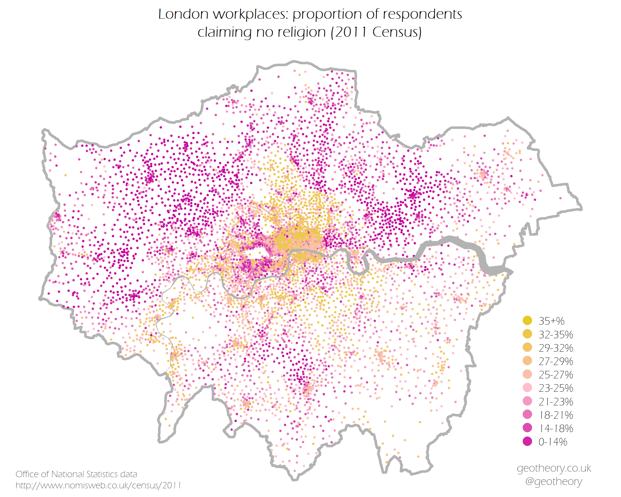
Gender in urban workplaces
In my previous post I plotted a map of London’s workplace (biological) gender divisions, which demonstrated some interesting spatial patterns of gender distribution across the captial. I decided to replicate this to get a more representative picture of how things look across the nation (in this case England and Wales given the extent of the data, the 2011 Census published by ONS via Nomisweb). Here I’ve plotted the same for 28 of the principal urban centres of England and Wales. The colours are scaled by quantile according to the data distribution for the whole of England and Wales. The city maps are all plotted to a 7 km square, which enhances comparability but clips London to The City (see last for the full London map).
23 June 2014
A new UK Census product – Workplace Zones
If you follow UK statistics you might know the Office of National Statistics has been developing a new set of geographies for reporting workplace-focused data from the 2011 Census, called Workplace Zones. The zones have been developed (following a pilot by the University of Southampton) using the existing census Output Areas as a starting point, but then merging and splitting these to create new shapes containing “consistent numbers of workers”.
30 May 2014
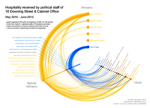
Hive plots - Visualising the hospitality received by Coalition Special Advisers
With political transparency an increasingly topical subject in the wake of press scandals and allegations of official coverup, it is a useful exercise to examine any data reflecting the interaction between our leaders and our purveyors of news. Since taking power the UK coalition government has published records of hospitality received by Special Advisers – ‘Spads’ the political staff serving UK Ministers – in the line of their official duties (a longstanding requirement of civil servants). I decided to compile the various reports into a single dataset and see what insights it might offer.
30 October 2013