My last post included a couple of plots of UK urban population growth, one of the absolute data and one with rank orders. Someone suggested visualising both together in an alluvial plot, which ranks data up a series of y-axes, each of which can represent a different data attribute. It’s a similar method to the parallel coordinates plot, except it also maps data values to line thickness and adds some swishy curves. Here I’ve tried disaggregating time along the x-axis instead, which I think (tweet me if I’m wrong) should make it a static network time-series alluvial.
The data is from the Stockholm International Peace Research Institute – an influential conflict research think tank. For all graphs the data is aggregated to 5 year intervals to smooth out annual fluctuations (so e.g. the 1980 peak in the first graph relates to data for the period 1980-84). Firstly looking at trends in weapons exports:
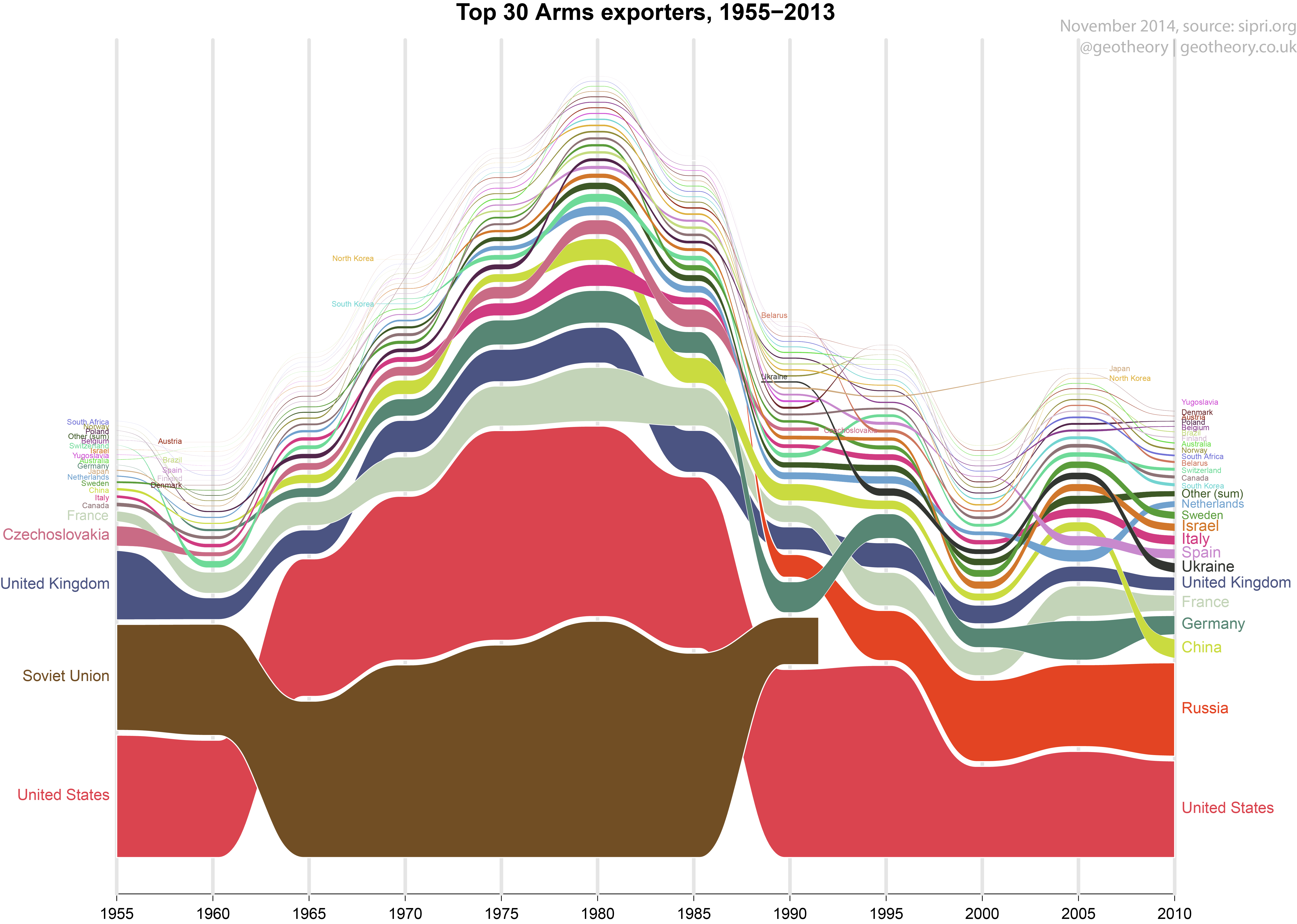
Some nice insights into the military economics throughout the Cold War, which deepened steadily in the years after WW2 as the superpowers became intertwined in proxy conflicts, to later escalate in the late 1970’s / early 80’s under Reagan and following the Soviet invasion of Afghanistan. The next graphic plots the top military spenders.

Little surprise the graph is dominated by a motley crew of recent conflict zones and autocratic regimes. The 1990’s ‘peak’ shouldn’t be read into as it is really just Kuwait’s response to it’s liberation by Operation Desert Storm. Aggregating components of unrelated budgets is pretty meaningless, hence the value of this graphic is in comparative terms. The Middle East stands out with some 7 of the top 10 military spenders in economic terms, reflecting the more domestic focus of the military in some of these states. It’s interesting to see how far Israel’s economy has remained on a consistent war-footing. And perhaps a little surprising how high the US must rank in proportional terms to foot the stupefying bill of being the world’s only superpower. More insight into this last can be gained by looking at state contributions to NATO:

Aside from the obvious US budgetary dominance of NATO, it’s striking how high its total budget has risen since the fall of the Berlin Wall 25 years ago, which contrasted sharply with predictions by some that it had ‘outlived it’s usefulness’. In fact NATO’s budget peaked in 2010 at $1.057 trillion (2011 USD), since when commitments in Afghanistan and Iraq have fallen.
It’s impressive how powerful alluvial graphs are to convey an accurate sense of relative distributions in a dataset. Stacking the data does come at the cost (at least with this alluvial arrangement which plots and ranks upwards) of making trends in smaller data rows less obvious, but by enforcing the rank structure it also neatly arranges records that would otherwise have cluttered up the same space. The graphs were produced in R. There already exists at least one excellent package for alluvial graphs, but I used a customised script based on grid library to make life easier for working with simple time-series datasets. This is free to use (but may include some bugs).
The function that produced these is now available as part of the alluvial package available on github.
[Previously published at geotheory.co.uk]