If you follow UK statistics you might know the Office of National Statistics has been developing a new set of geographies for reporting workplace-focused data from the 2011 Census, called Workplace Zones. The zones have been developed (following a pilot by the University of Southampton) using the existing census Output Areas as a starting point, but then merging and splitting these to create new shapes containing “consistent numbers of workers”. This is somewhat aspirational considering that, in London alone, the zones range from 100 to 11,000 workers (upper/lower quartiles at 310/550 respectively), indicating a degree of variance. This notwithstanding, Workplace Zones and the new statistics than were published for them last week are a great new data source adding significant potential value to research into urban dynamics and workplace-related trends more generally. Here is a map of the boundaries of the new zones, with the centroid points also plotted as I’ve used these points for plotting the statistics:
Here I’ve mapped some of the more interesting stories I’ve spotted so far in the data for London. For each dataset I’ve made a map each for both Greater and Central London areas, the reason being that employment densities in the centre are so much higher than elsewhere that for any map of Greater London the central zones are little more than pixels. This centre/periphery disparity also presents a challenge for data visualisation as the customary choropleth method (colouring the zones to represent data) leads to the map’s ‘narrative’ being overly dominated by relatively low employment density areas. Instead I’ve chosen to use points to represent the data, which gives a much better idea of employment densities across the capital. Some point over-plotting seems a fair price to pay for a less misleading map. All the maps group the data by decile (10 quantiles), so the break of the 5th and 6th deciles is the map area’s average (rounded). The Central London maps have their own colour scales.
Take a look and see what you think. For visualisation enthusiasts, at the end of the post I compare one of these to a choropleth and cartogram of the same data.
Male/female proportions in the workplace..
Some interesting patterns emerge of higher female workforce proportions in parts of west-central London, and in the town centres across in Greater London. It’s no surprise that the City remains very male-dominated.
Who works the longest hours?
Quite a patchy story. Central London, the City and Docklands in particular, work the longest hours by and large. Towns outside the centre tend to work least overtime.
How does religious belief break down in workplaces across the city?
North London workplaces emerge as generally more religious than South of the river (although the area stretching north from Croydon is a notable exception). There is also quite a strong non-religious region stretching northwards from the centre. Central London itself shows some strong patterns, with the religious City and districts to the West clashing with the far more non-religious workplaces across Soho, Bloomsbury, Angel and Clarkenwell.
Which workplaces have healthier workers?
No surprise that the healthier workplaces tend be in higher earning parts of the city.
Which workplaces have higher education levels?
Here we’re seing broadly similar patterns to workplace employee health levels.
Which workplaces are more culturally diverse?
Here I’ve used European first languages (excluding English) to represent ‘diversity’. While certainly not the best or only proxy, it does relate closely to some of the racially-associated political debates (particularly immigration from Europe) that have dominated public debate in recent weeks. I’ll leave the map interpretations to the reader, but it should be noted that this category includes many non-permanent immigrants (such as workers on temporary work permits), as well as some large non-European groups such as employees originally from Latin America.
How far do people travel to work?
No-one will be surprised to see the poor commuters to Central London tend to cover the longest distances. Towns outside the centre tend to have the shortest commutes, but workers in and around Heathrow tend to have longer journeys. In the centre there’s quite a strong pattern of longer commuted for workers in the City, Westminster and Victoria areas compared to other areas, perhaps reflecting stronger Home County residential demographics.
How do people get to work?
The following categories represent the primary mode of transport to work that respondents reported:
by train..
by tube and tram..
We see a strong contrast between Central London workplaces that are typically accessed by train compared to those accessed by Tube and other modes of rail, with the City and Westminster’s heavier dependence on trains reflecting the longer commutes of their workers, as illustrated in the travel distances map above.
by bicycle..
and walking..
These categories are a little less clear in terms of Central London spatial patterns other than some notable cycle-to-work hot-spots in Soho, Clerkenwell and Shoreditch. Outside the centre, bicycle is a lesser-used mode of transport, but many more people walk to work in town areas.
Alternative methods for visualisation
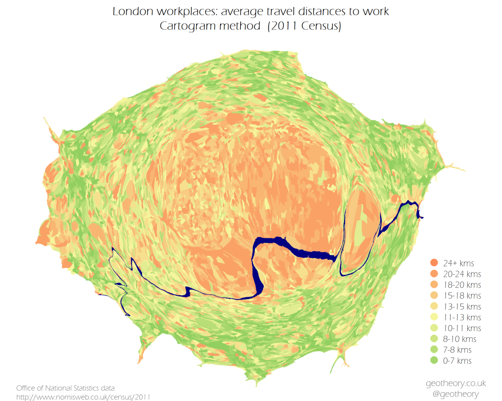
For the purpose of comparing methods of visualisation here are three approaches for the same map – the travel to work distances. The first is a repeat of above for convenience:
Here is the fairly customary choropleth..
Lastly the cartogram approach..
In my opinion the choropleth is least useful as it (a) renders half the data unreadable (in the centre.. the most economically important zone), and (b) precludes any sense of workplace densities. The cartogram (made with the brilliant little scapetoad app) calculates zonal areas proportional to their working populations, which actually gives a nice sense of the quantitative distributions in the data, but of course it reduces the reader’s ability to accurately interpret locations, and again you lose the sense of where the peripheral high employment density areas are. In my opinion the points win, but I’d be interested to hear other views.
[Previously published at geotheory.co.uk]


