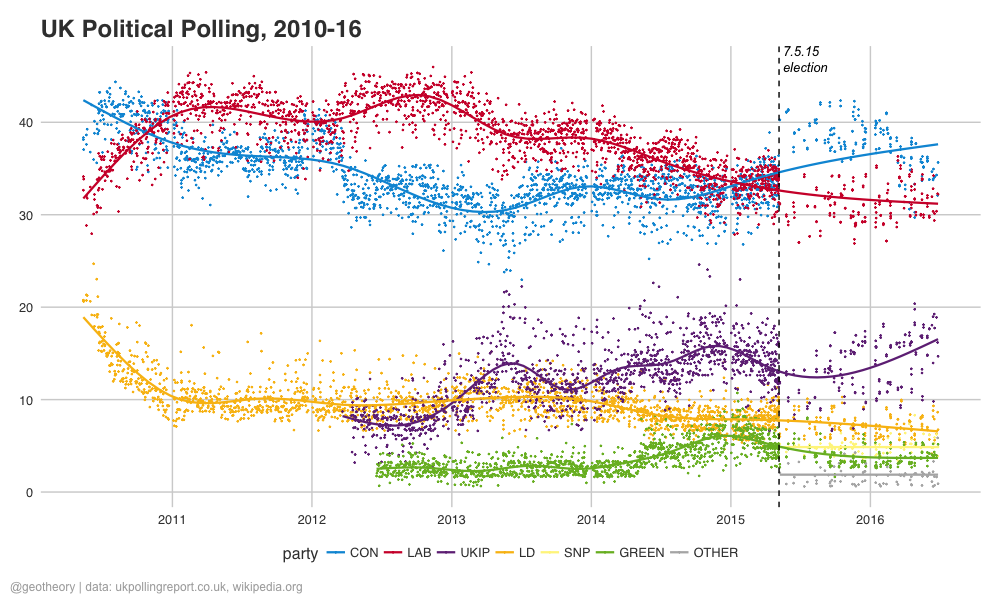
In light of last week’s EU Referendum shockwave I had a quick look into the polling situation. Plotting a few graphics of data from ukpollingreport.co.uk and wikipedia.org, here are the results:
I wasn’t aware polling activity had dropped off after the May 2015 election, and wondered which polls had ended – so here’s the plot for the top polling programmes over the past 6 years:
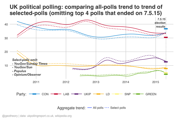
We can see that the biggest single change is that News International has cut their links with YouGov. Some quick Googling hasn’t thrown up anything on this, but it must be reported somewhere. I wondered what the impact on aggregate polling trends would have been without some of the top polling programmes that ended on election day. Here’s how it breaks down:
Interestingly the two trends converge at the election for all the parties. Aside from that point however the top 4 polling programmes do change the trends marginally, boosting Conservative and especially Labour by over a percent at the expense of the other 3 parties (the effect on SNP isn’t captured in this data), but the effects are well within the margin of the Conservative lead on election day. So we can conclude that all the extra polling by News International/YouGov, Populus and Opinium/Observer probably didn’t have a significant impact on the (overall inaccuracy of) aggregate poll trends, although they narrowed the confidence interval. Here are the mean summaries for the period:
party All polls Select polls Difference
  CON     33.89        32.87       1.02
  LAB     38.31        36.72       1.60
 UKIP     12.29        12.99      -0.71
   LD      9.71        10.62      -0.91
GREEN      3.69         4.33      -0.64
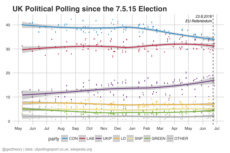
Summarising polling activity for the 12 months after the election:
Lastly, the polling data since the election:
[Previously published at geotheory.co.uk]


